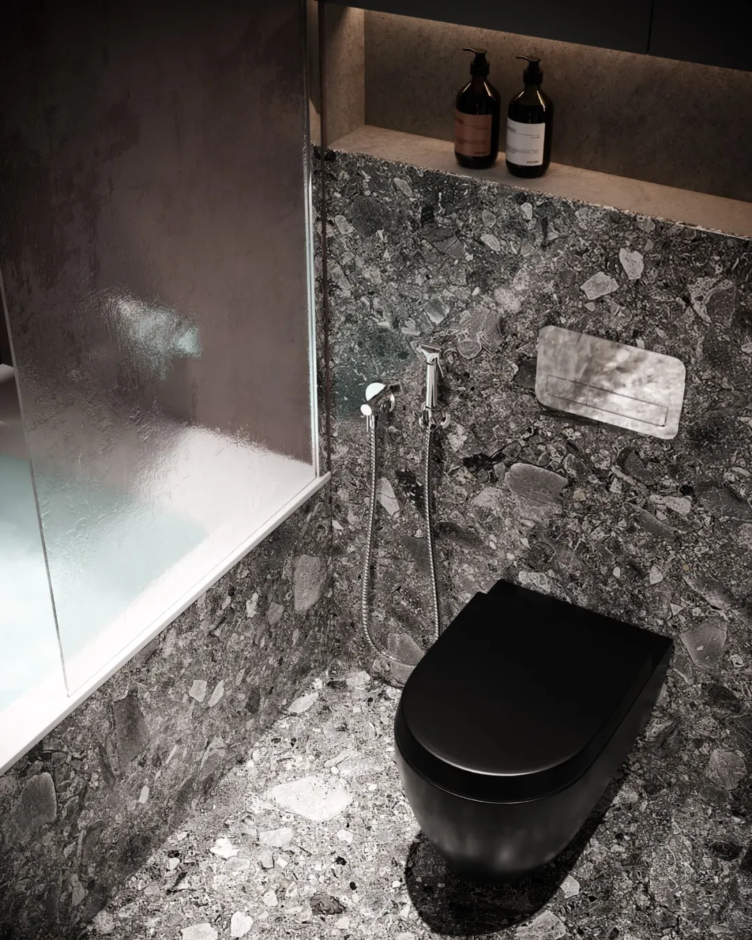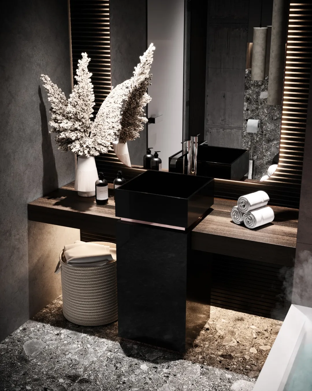
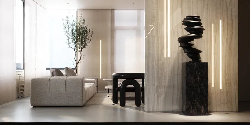
这栋位于基辅的顶层住宅,在设计团队Obriy Architects的精心打造下,以绝佳的地理位置,还有出色的视野奠定了它的观赏性。设计师将自然光线灵活应用,带入室内,让更多温暖色系的材料充斥着家里。
This top-level residence in Kiev, elaborately built by the design team obry architects, has established its ornamental value with excellent geographical location and excellent vision. Designers will be flexible application of natural light, into the interior, so that more warm color materials filled the home.

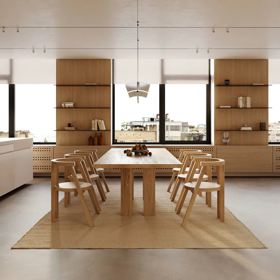
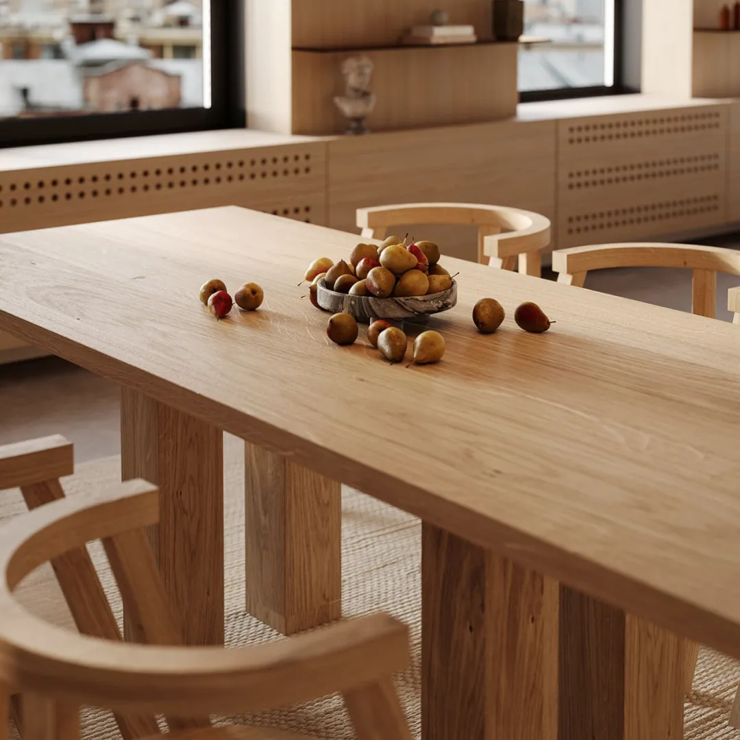
窗户部位的设计,设计师采用了画廊的感觉,框架以及墙体覆盖着整个空间,这类元素充斥着厨房、餐厅等多个区域,设计师还很贴心的在窗户底下,专门加入了可以加热的物品。
In the design of the window part, the designer adopts the feeling of gallery. The frame and wall cover the whole space. This kind of element is full of kitchen, dining room and other areas. The designer also adds heating items under the window.


地板为混凝土材质,和纯白的石膏设计元素融合,让整个空间的色彩更加鲜亮,使得木色都并不单调,空间中显得丰富有魅力。
The floor is made of concrete, which is blended with pure white gypsum design elements, making the color of the whole space more bright, making the wood color not monotonous, and the space appears rich and charming.
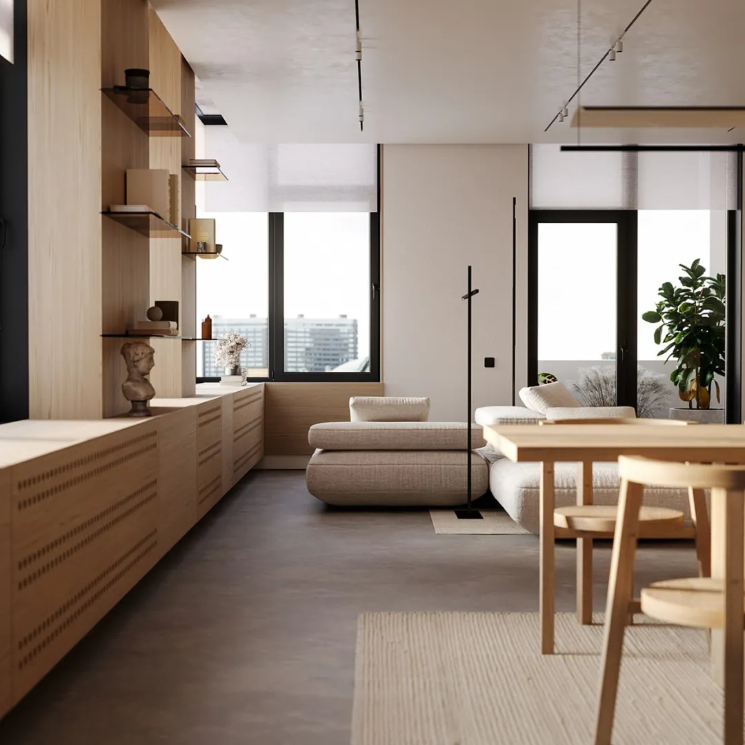

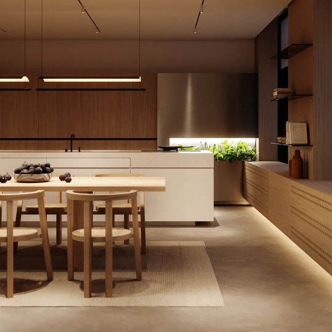
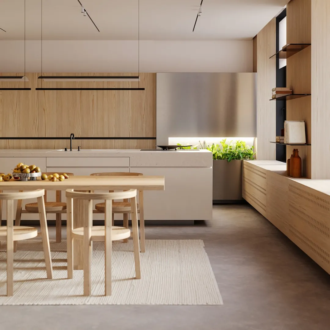
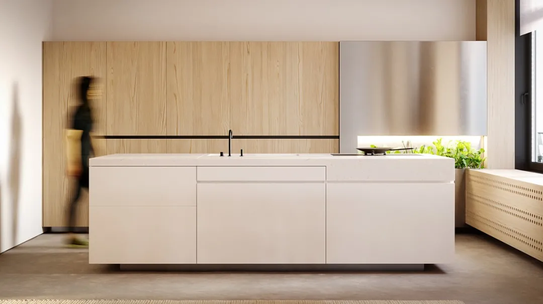
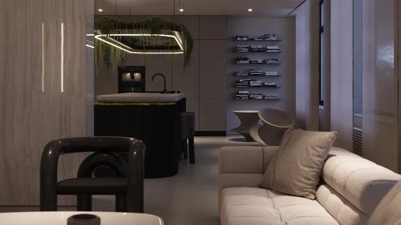
厨房部位的设计特别宽旷,线条感清晰明确,岛台的设计更是融入了纯白色,细腻且光滑,木色的空间里,颇有现代艺术氛围。
The design of the kitchen part is particularly wide and the line sense is clear and clear. The design of the island platform is integrated into the pure white, delicate and smooth space with wood color, which is quite modern art atmosphere.
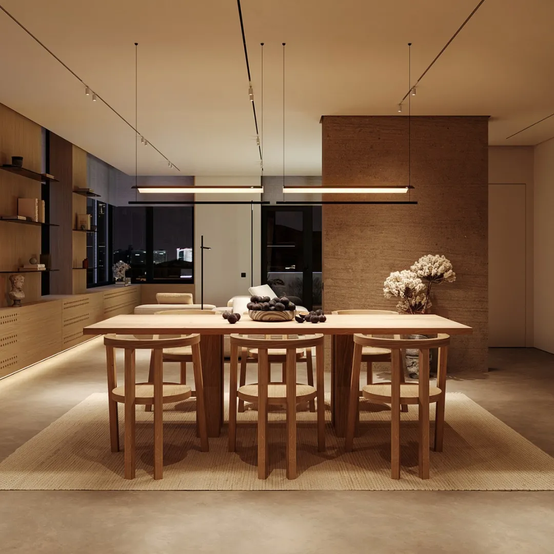


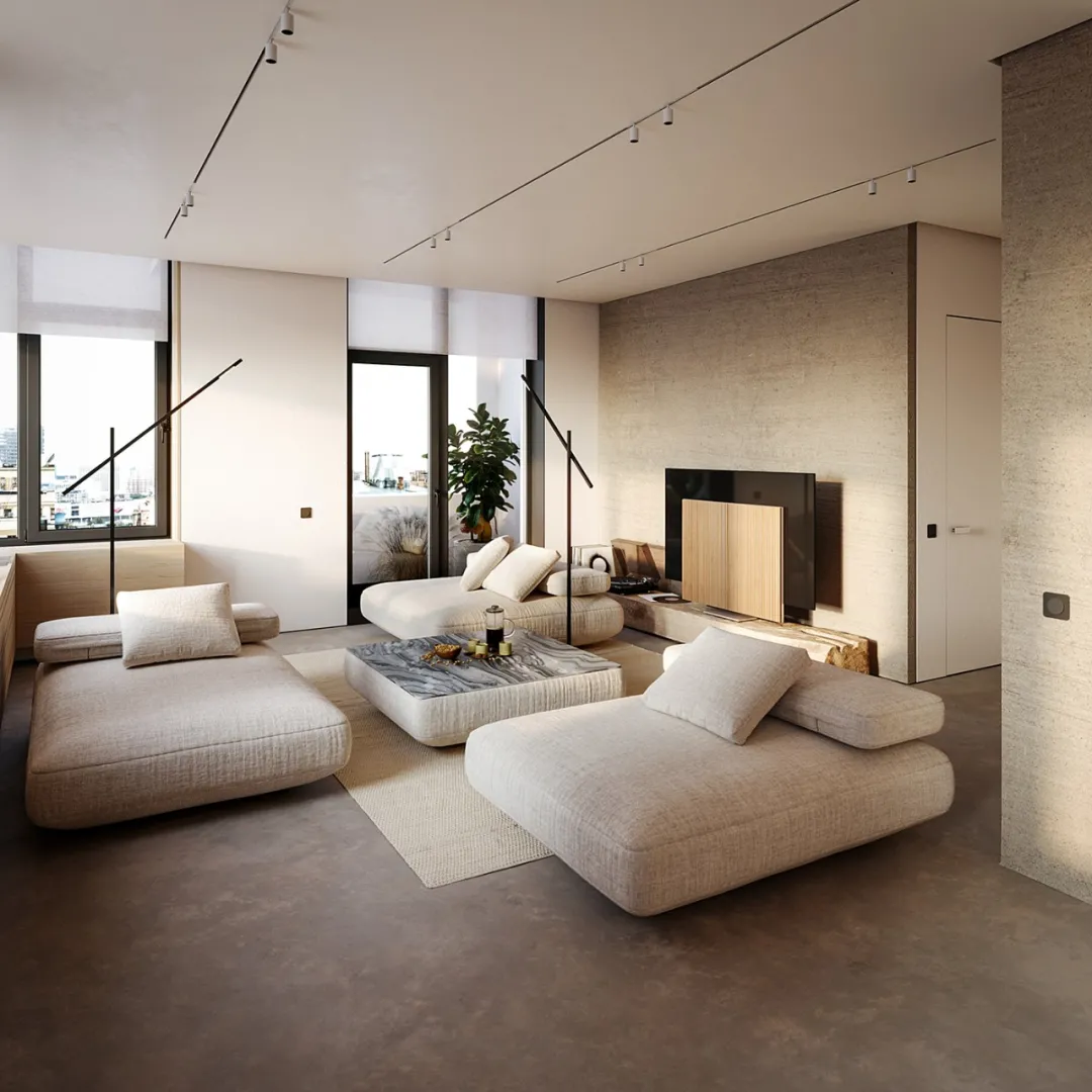
最特别的地方在于,不同区域的沙发造型不一样,这里设计师根据不同的功能区进行设计,让用户可以一直保持着新鲜感。
The most special thing is that the sofa shapes in different areas are different. Designers here design according to different functional areas, so that users can always keep a fresh feeling.
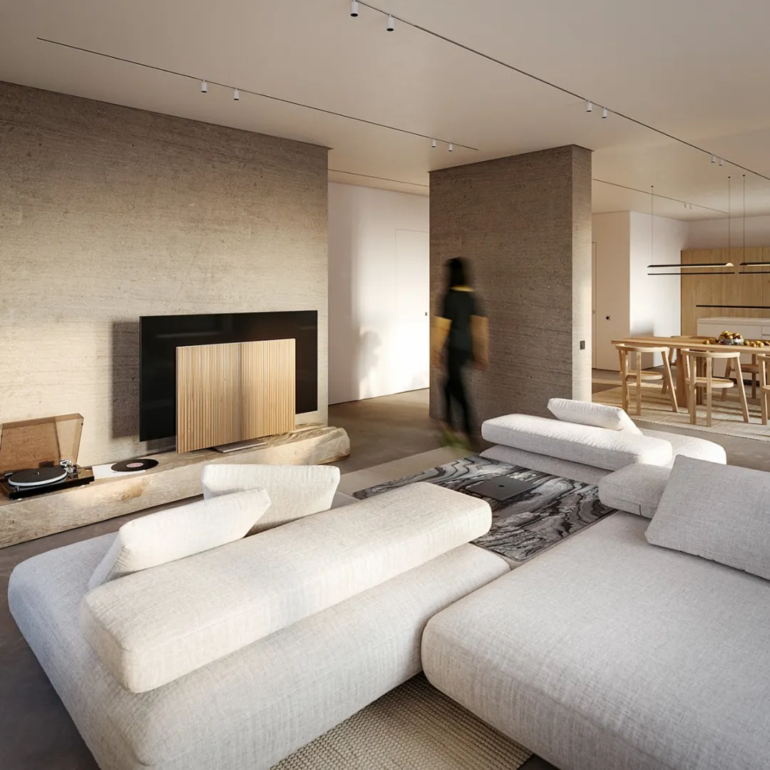
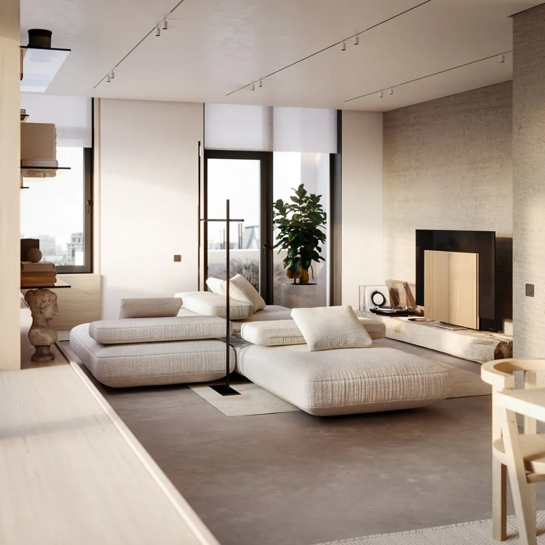
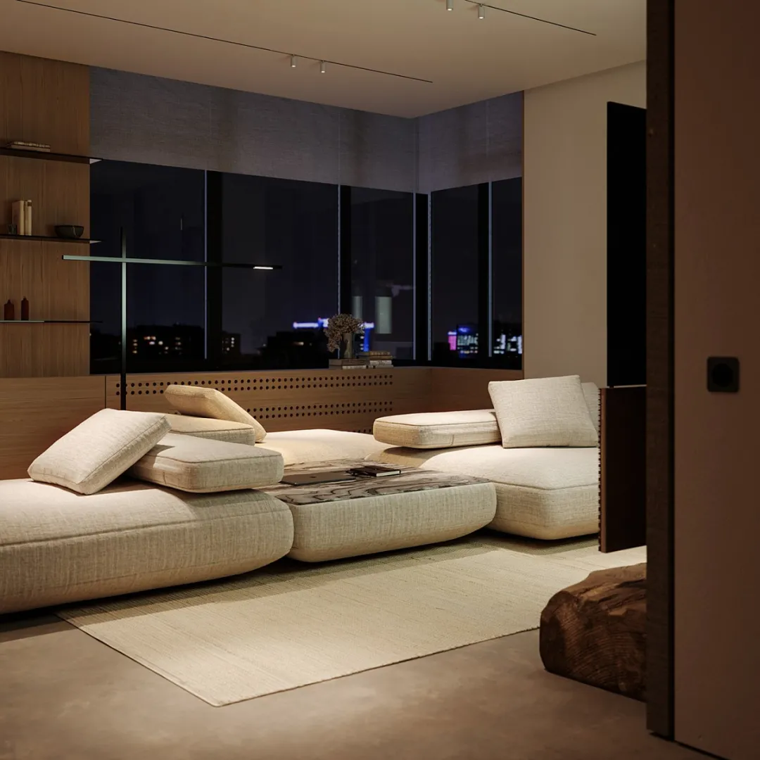


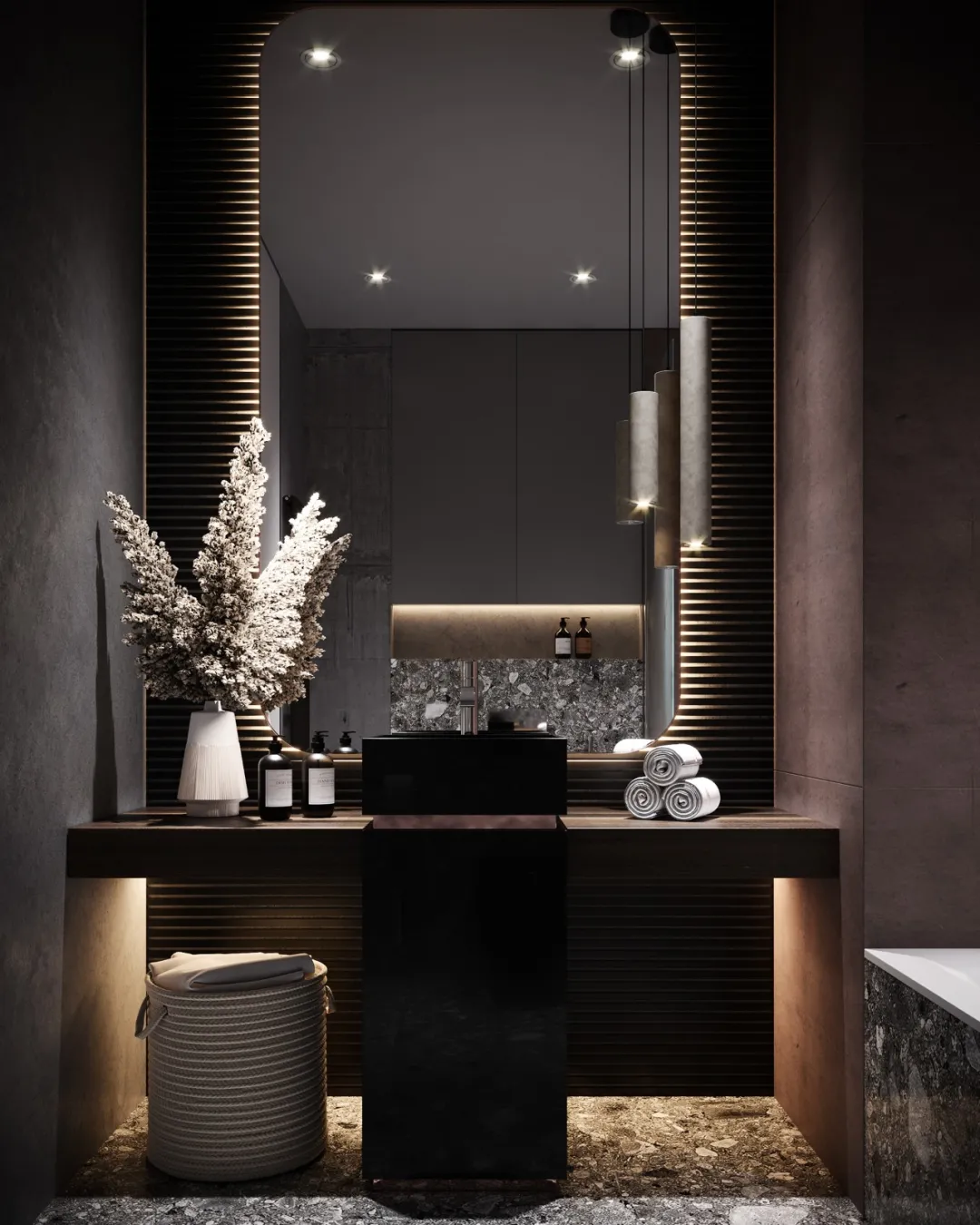
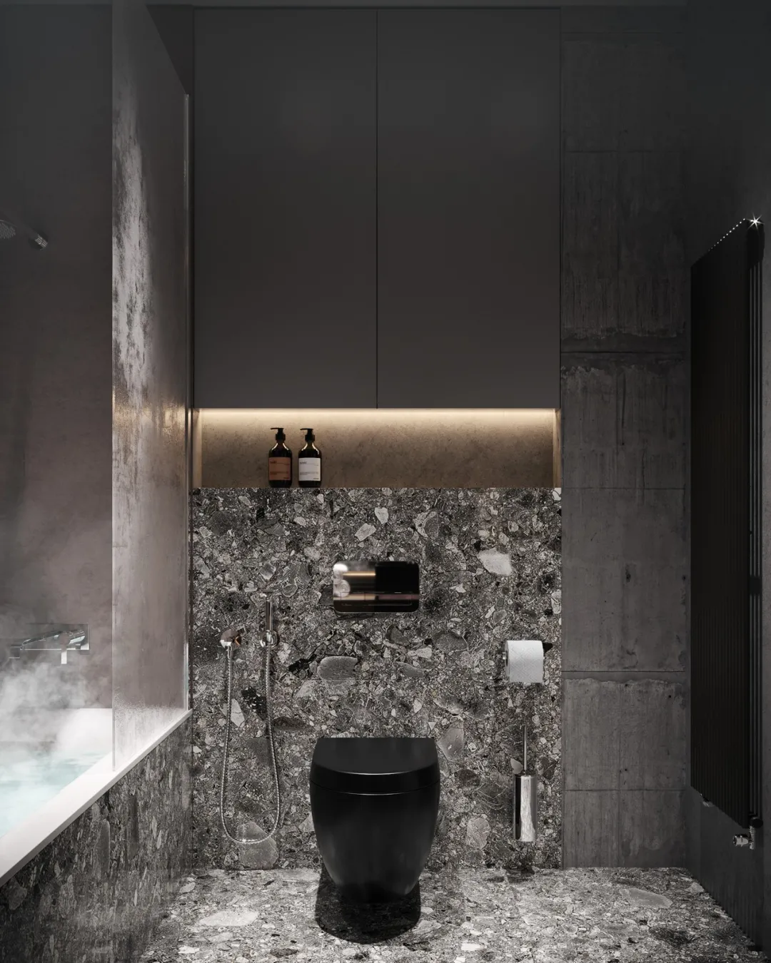
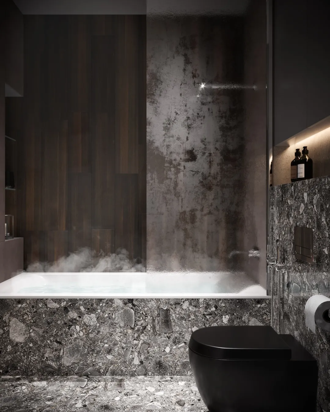
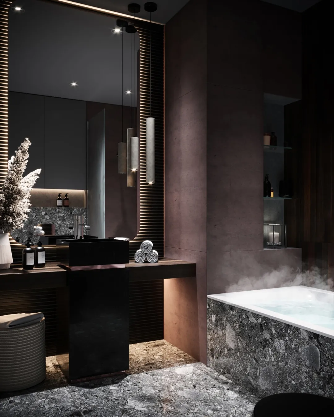
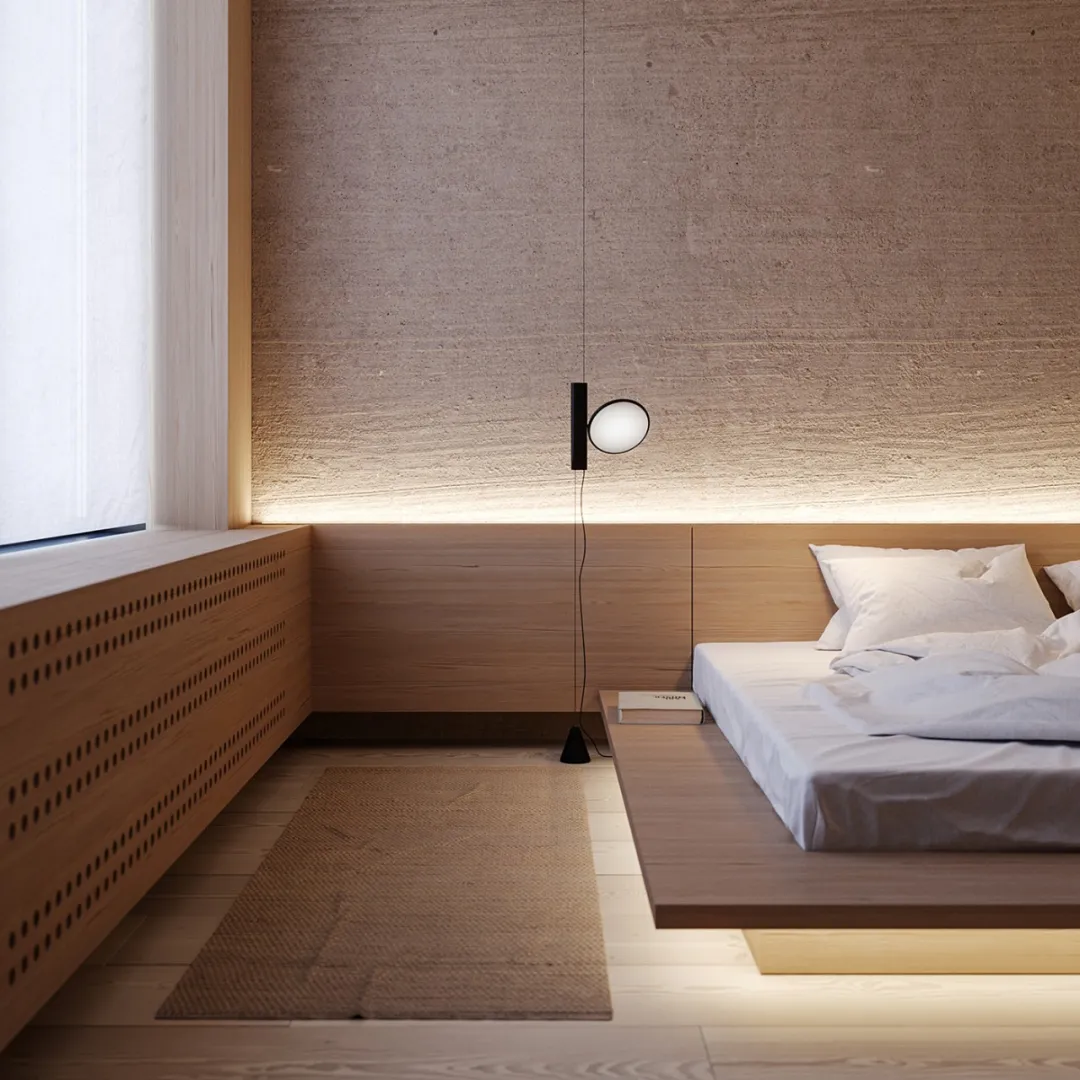
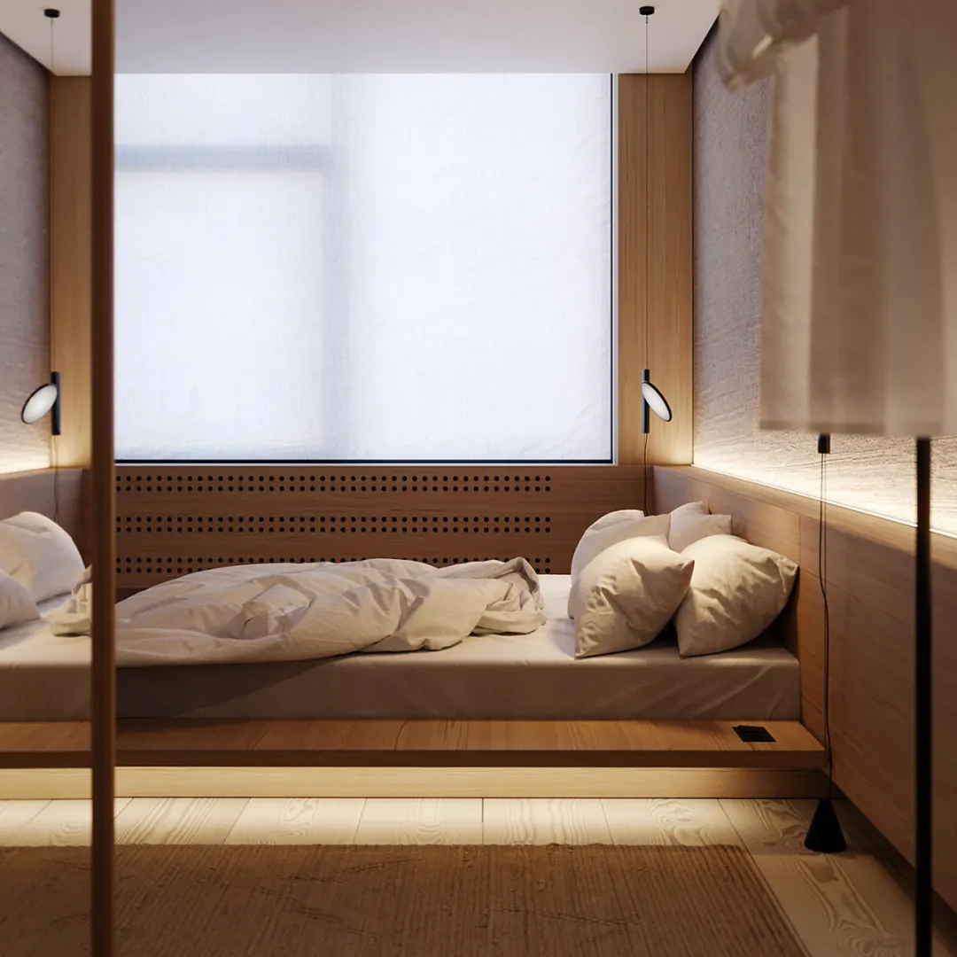
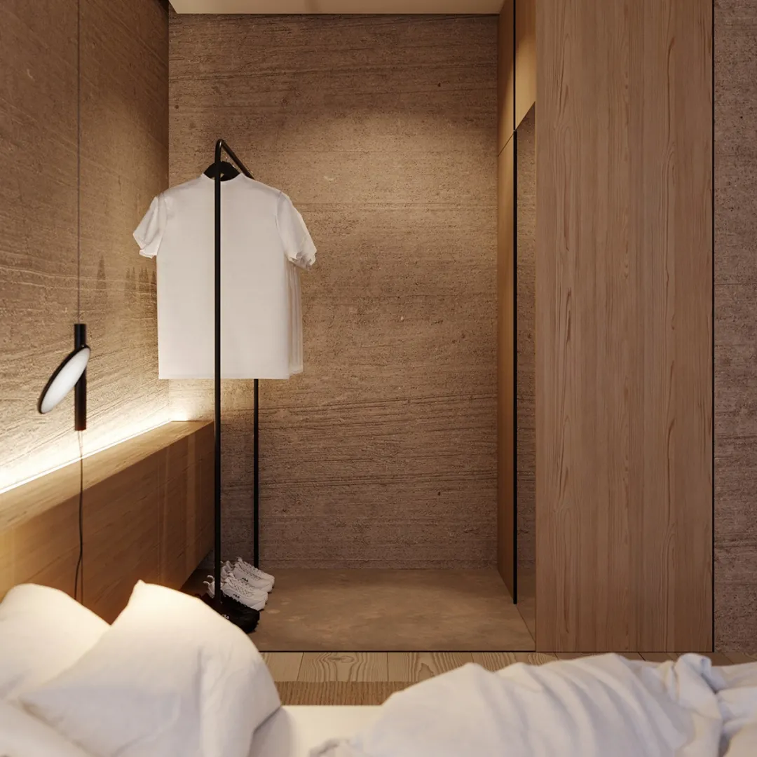
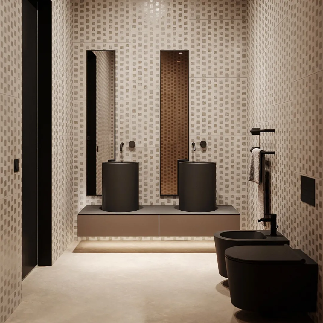
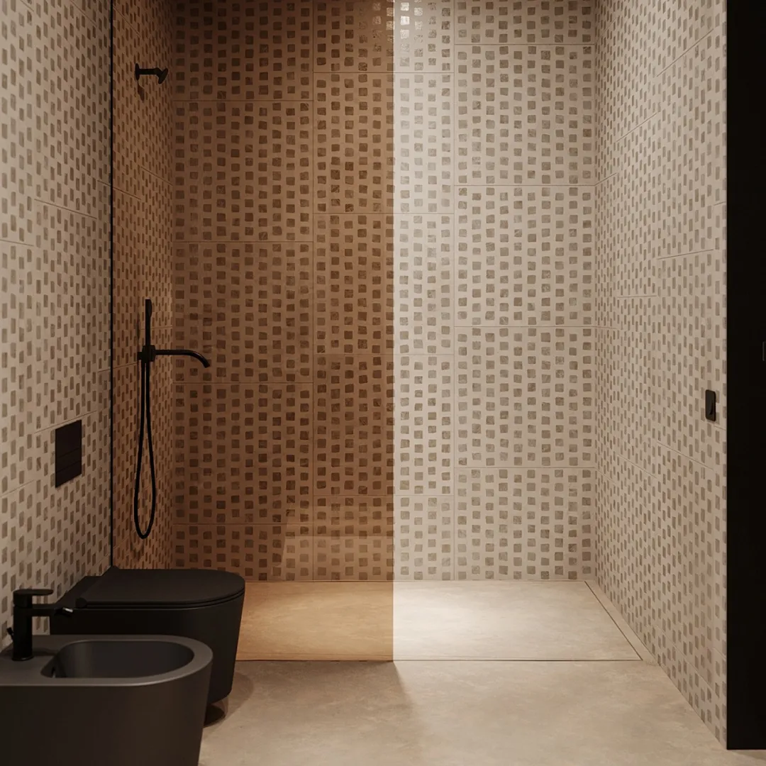
卧室的氛围显得轻松惬意,整体的木色元素,让空间更加明快,给人稳重的安全感。那连接着卧室的浴室,以几何手法进行表现,显得极为艺术。
The atmosphere of the bedroom is relaxed and comfortable. The overall wood color element makes the space more bright and fast, giving people a stable sense of security. The bathroom connecting the bedroom, with geometric means of expression, appears extremely artistic.




About.
Obriy Architects
这支来自乌克兰的设计团队Obriy Architects,他们的设计轻快且简洁,他们认为设计要保持传统予以创新,整个领域包括室内以及商业等。
This Ukrainian design team obry architects, whose design is light and simple, thinks that design should keep tradition and innovate, and the whole field includes interior and business.

其他佳作
Polar



Apollo


来自卡塔尔的设计师Kamran Kerimov,这次将一座141㎡工业风的空间以全深色的格调去设计,不仅将原有的混凝土元素保留下来,而且还加入了更多的木质元素,使得空间对比充分。
Kamran kerimov, a designer from Qatar, designed a 141 square meter industrial wind space in full dark color, which not only retains the original concrete elements, but also adds more wood elements, making the space fully contrast.
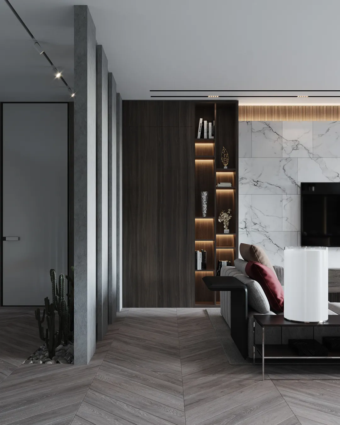
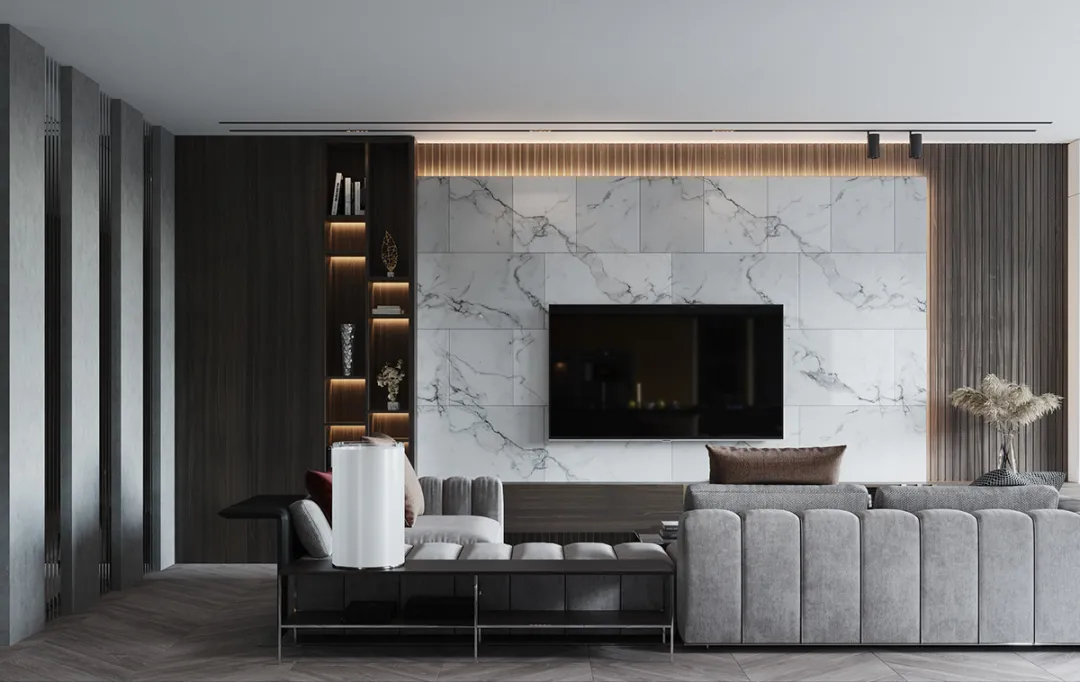
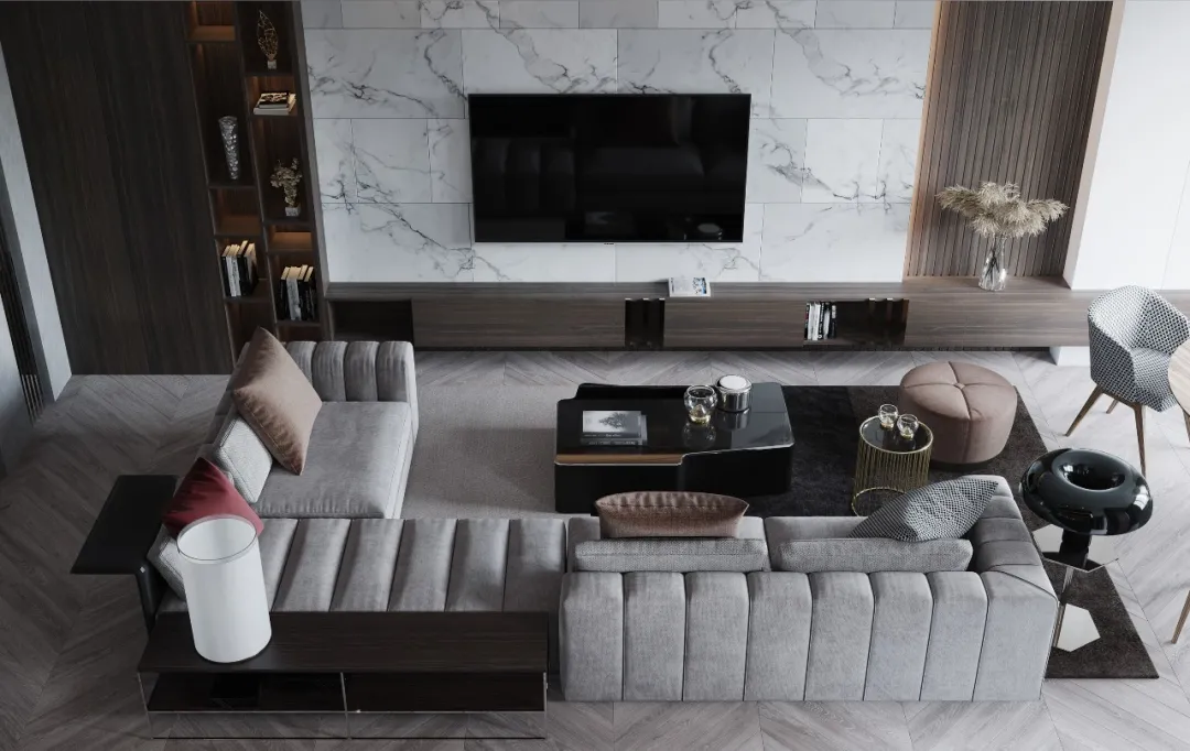
首先客厅的设计中,主要色调为浅灰色,那简单却富有质感的软装,让空间中的格调更上档次,不仅柔和而且温馨。
First of all, in the design of the living room, the main color is light gray, which is simple but full of texture of soft clothes, so that the style in the space is more grade, not only soft and warm.
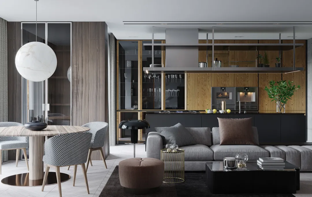
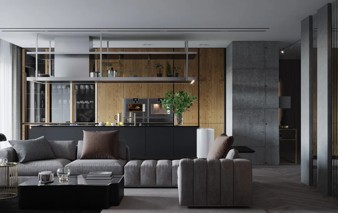
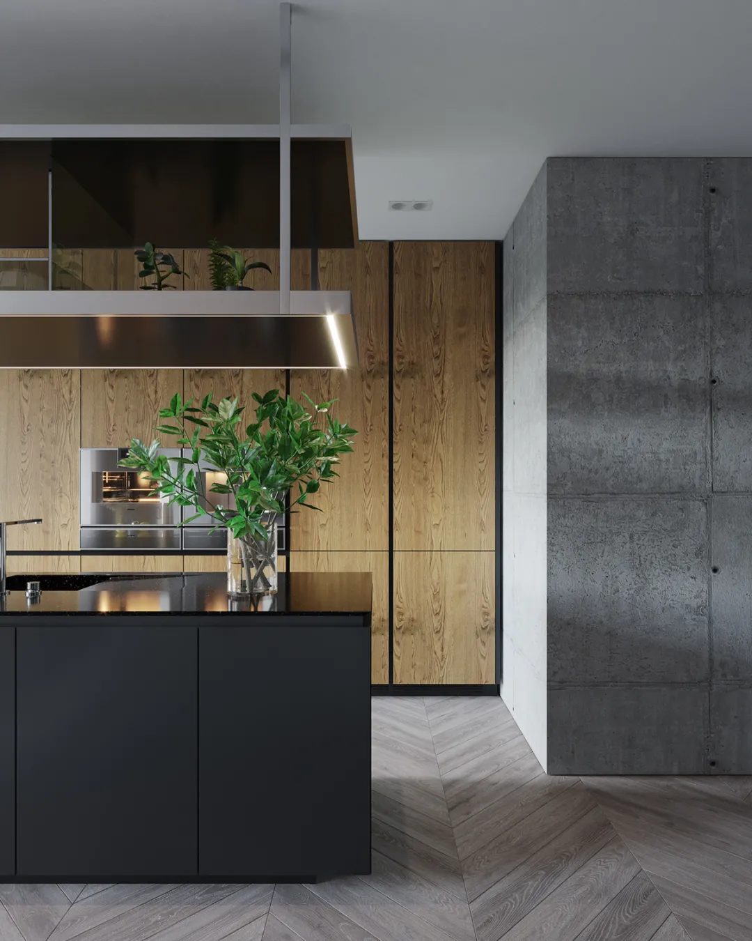
木色的元素使得空间活力更足,配合绿植和灯光后,看似冰凉的水泥墙也显得柔和许多,如此朴素的色彩却更具魅力。
The wood color elements make the space more dynamic. With the green plants and lights, the seemingly cold concrete wall appears to be much softer, but the simple color is more charming.
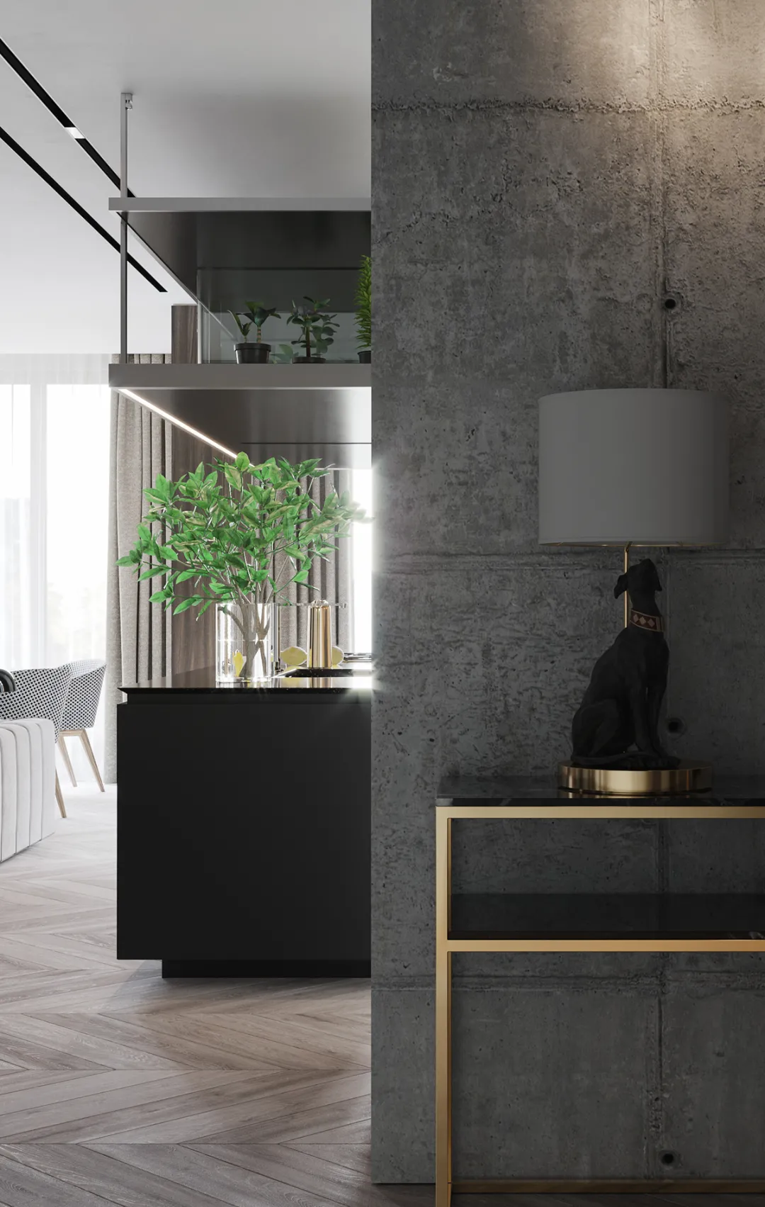
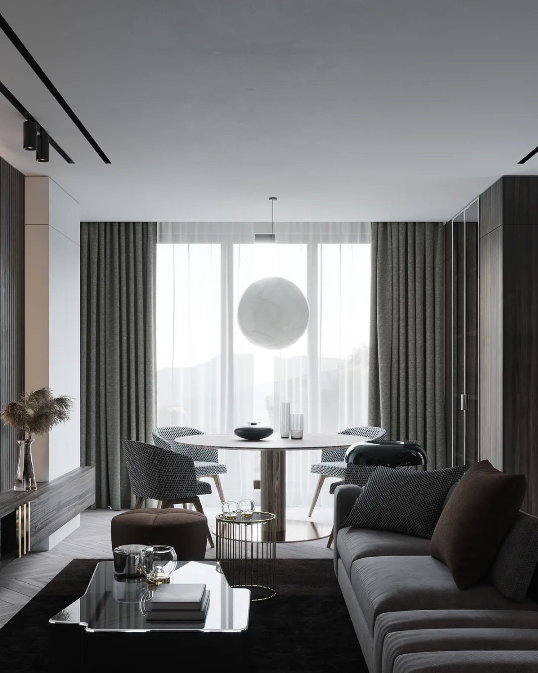
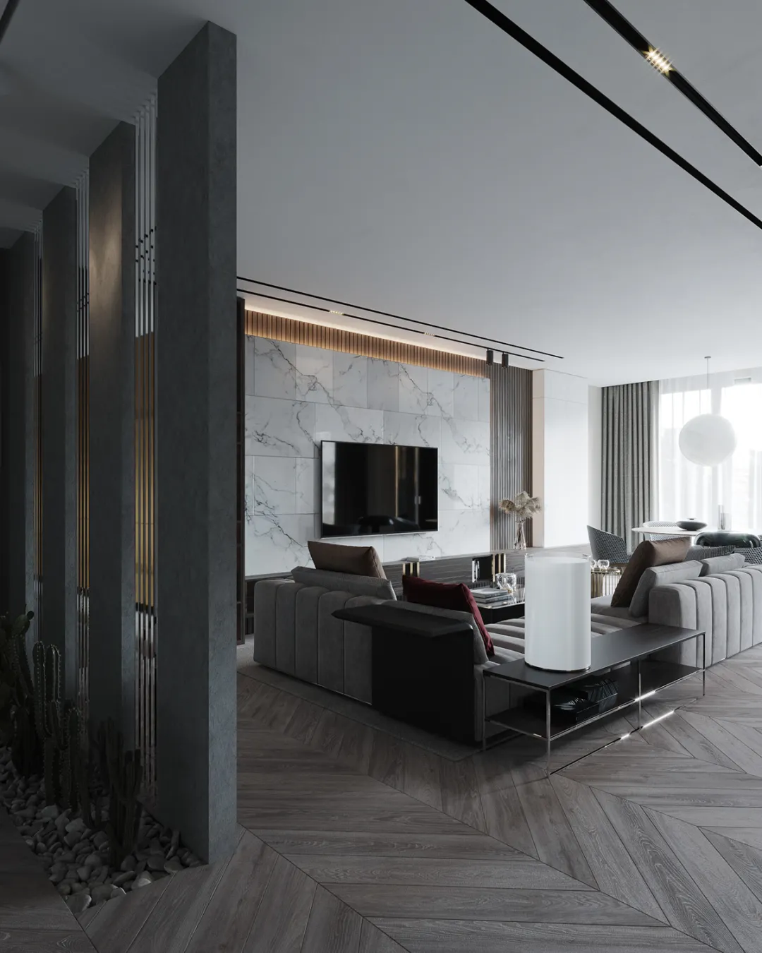
设计师将客厅和门厅中间的通道打开,使得中间毫无阻隔,让人一望无际,空间再添宽阔。不过为了提升保护性,设计师在门厅处还是进行了少部分的水泥隔断,时尚也有用。
The designer will open the passageway between the living room and the foyer, so that there is no barrier in the middle, so that people can see as far as possible, and the space will be widened again. However, in order to enhance the protection, the designer still carried out a small part of the cement partition in the hall, fashion is also useful.
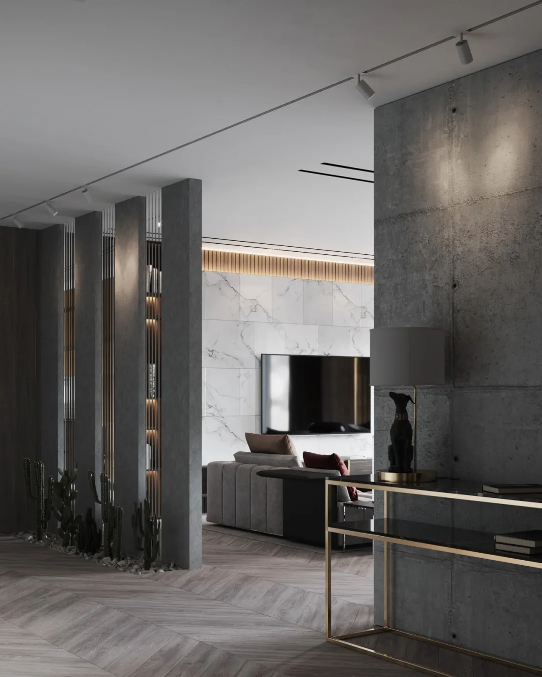
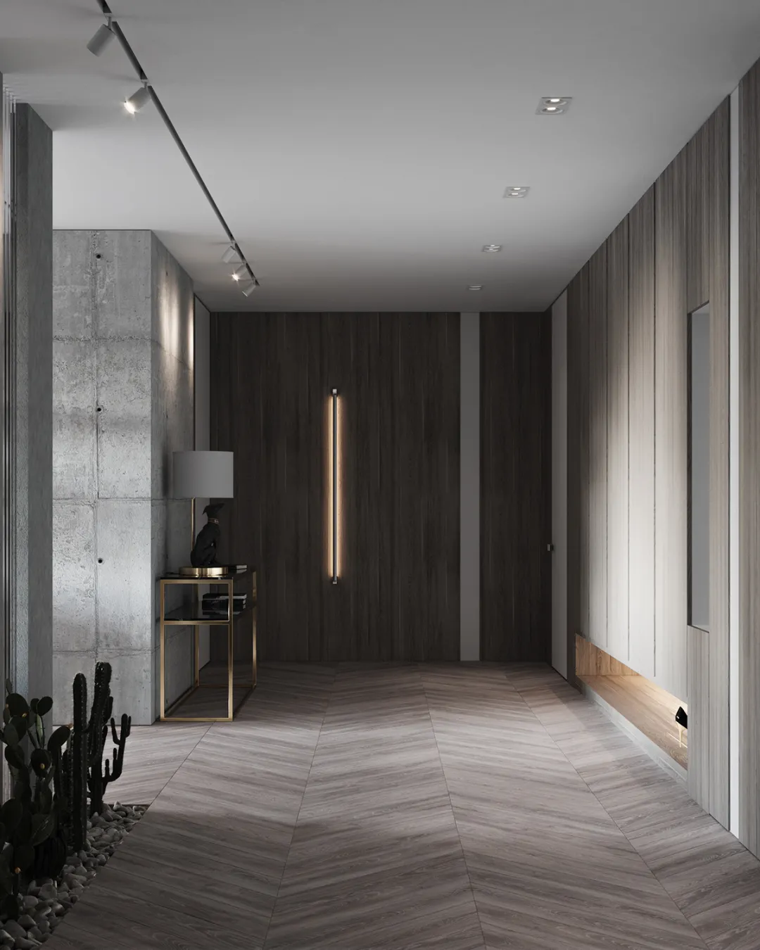
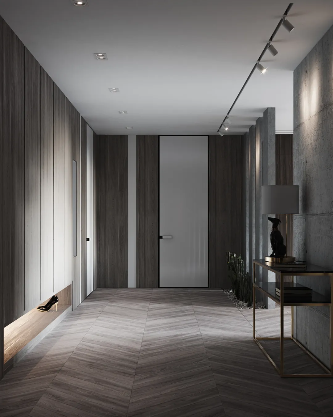
走向卧室的走廊,宽敞且明亮,那白门和木饰面,两者之间对比后更显得潮流时尚,隐藏式的储物空间,提升了空间使用率。
The corridor to the bedroom is spacious and bright. The white door and wood veneer are more fashionable after comparison. The hidden storage space improves the utilization rate of space.
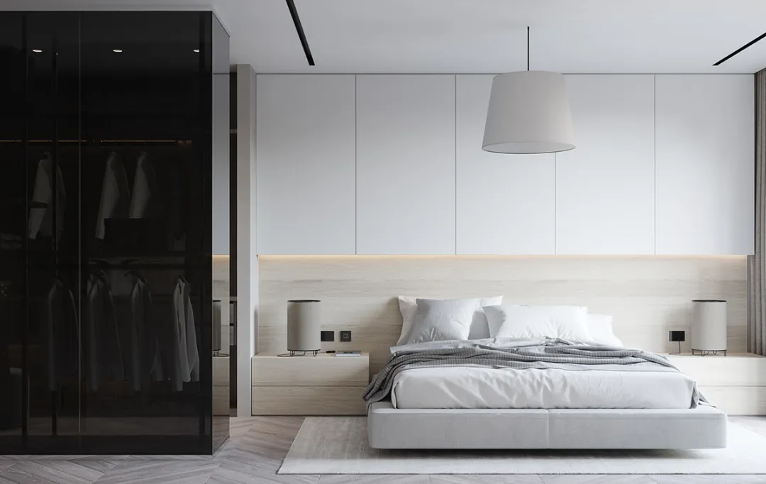
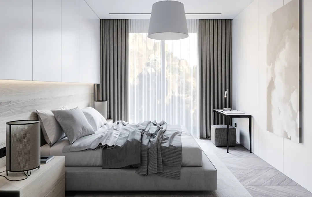
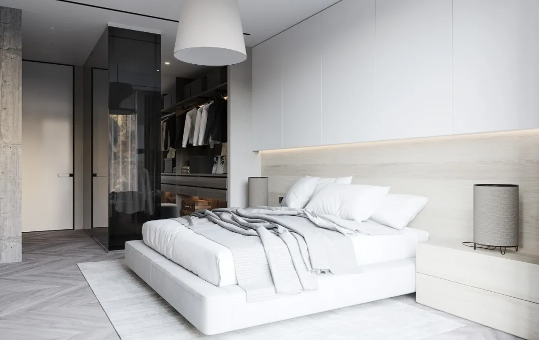
卧室的设计偏向于干净清爽的风格,灰色元素的减少,更多米色白色的加入,让空间更加舒适,其中的落地窗更是将室内外相互衔接,具有较强的生态感。
The design of the bedroom tends to be clean and fresh. The reduction of gray elements and the addition of more Beige white make the space more comfortable. The floor to ceiling windows connect the indoor and outdoor with a strong ecological sense.
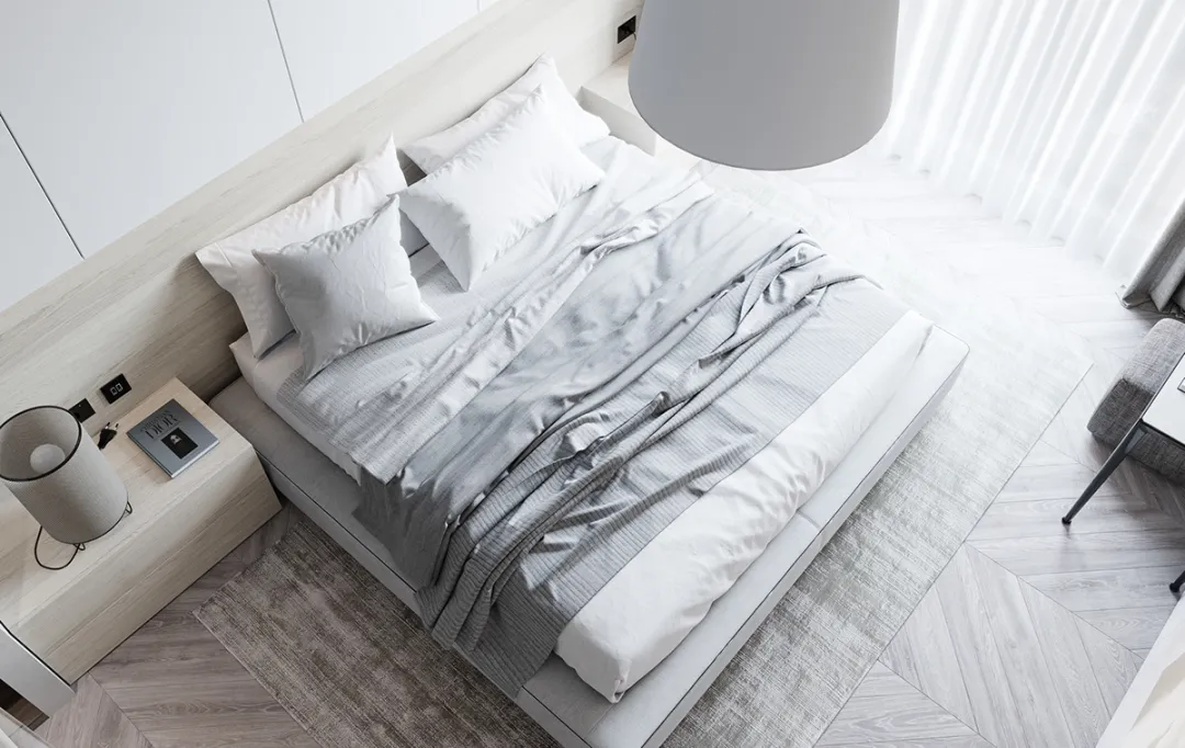
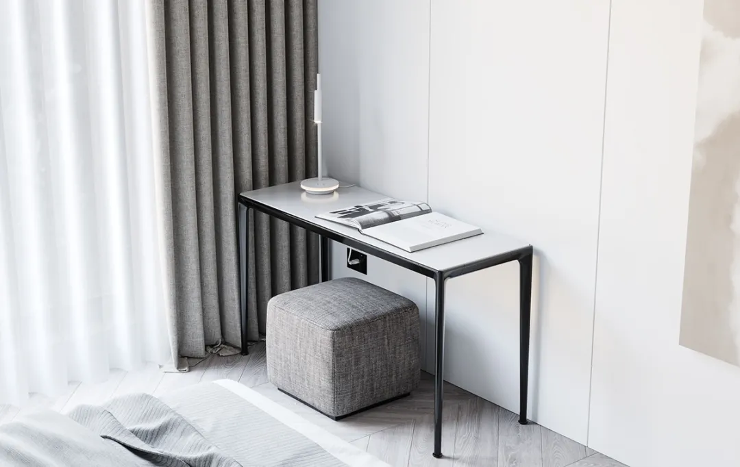
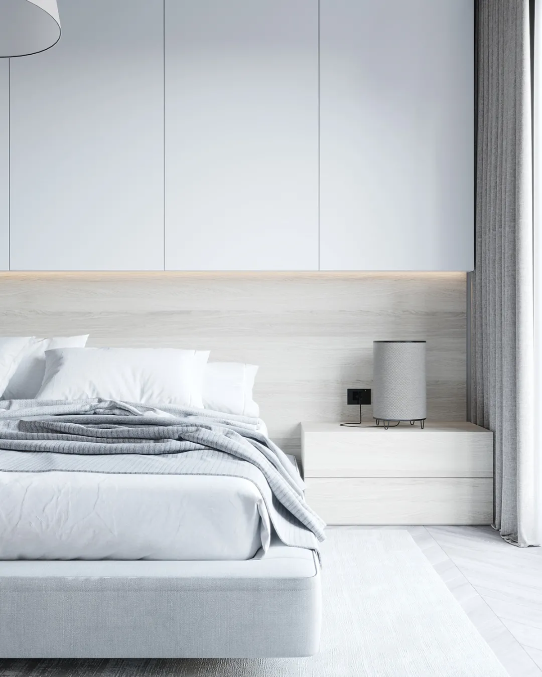
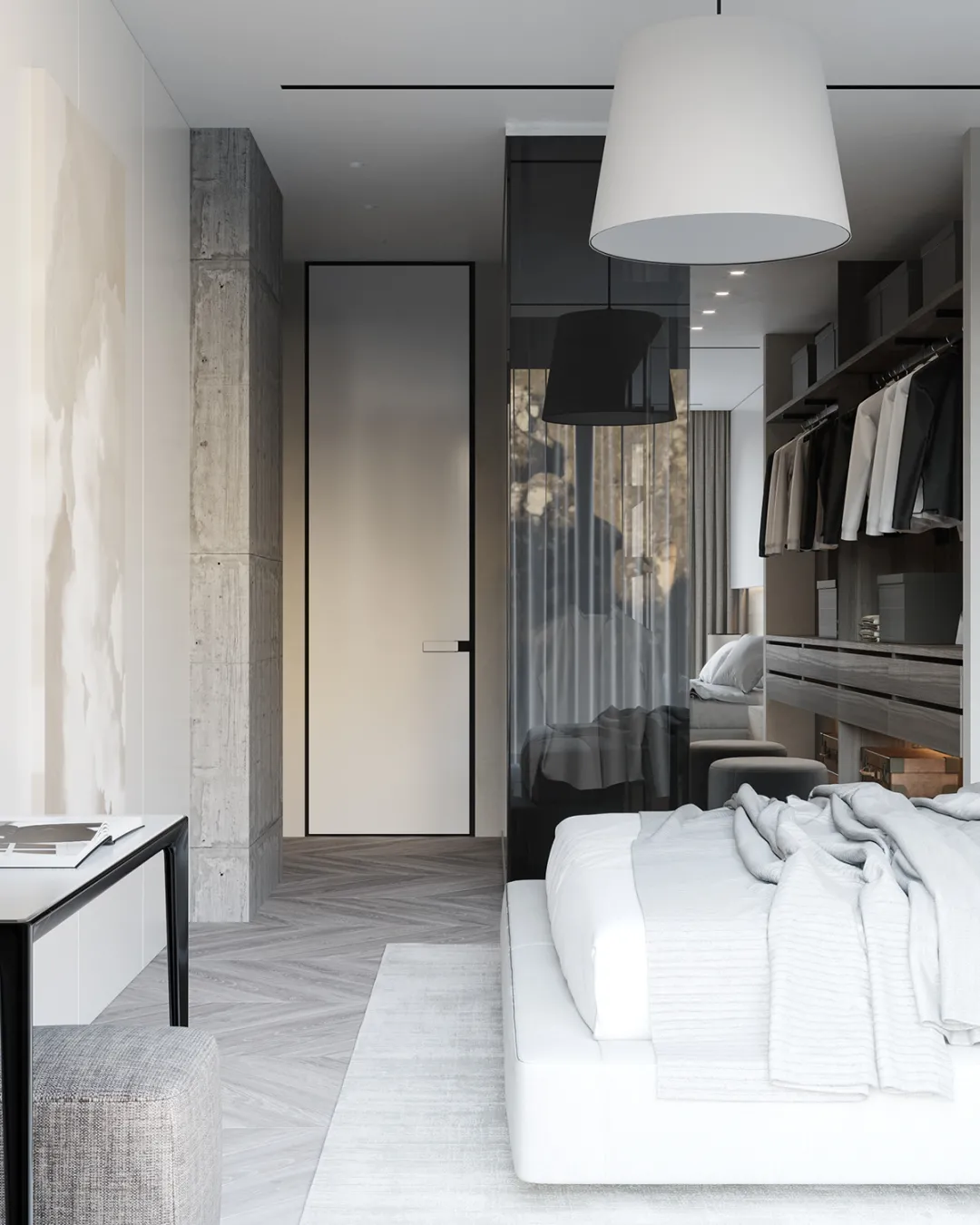
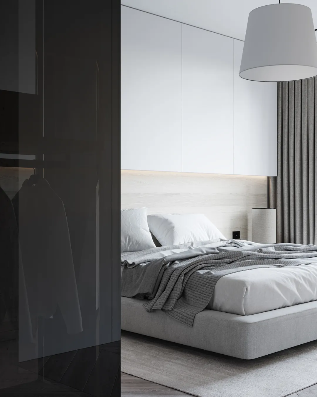
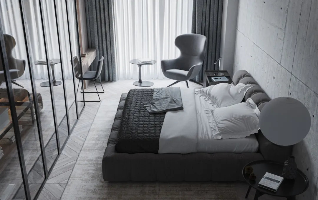
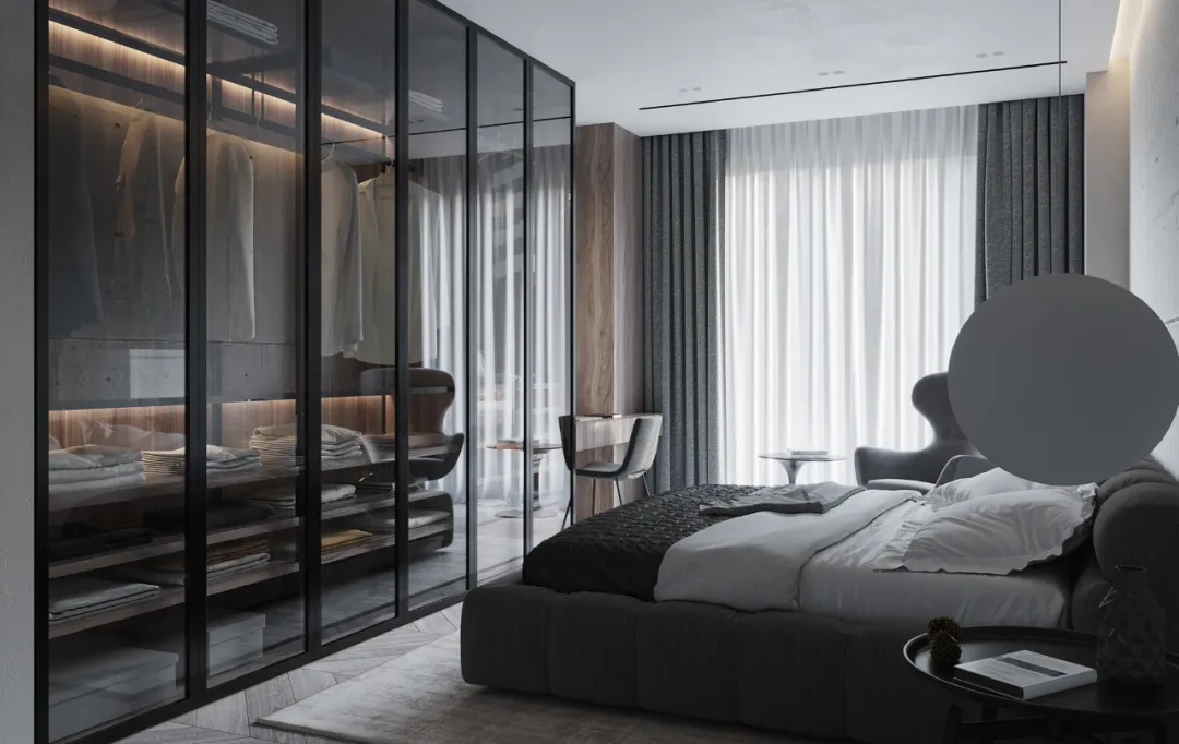
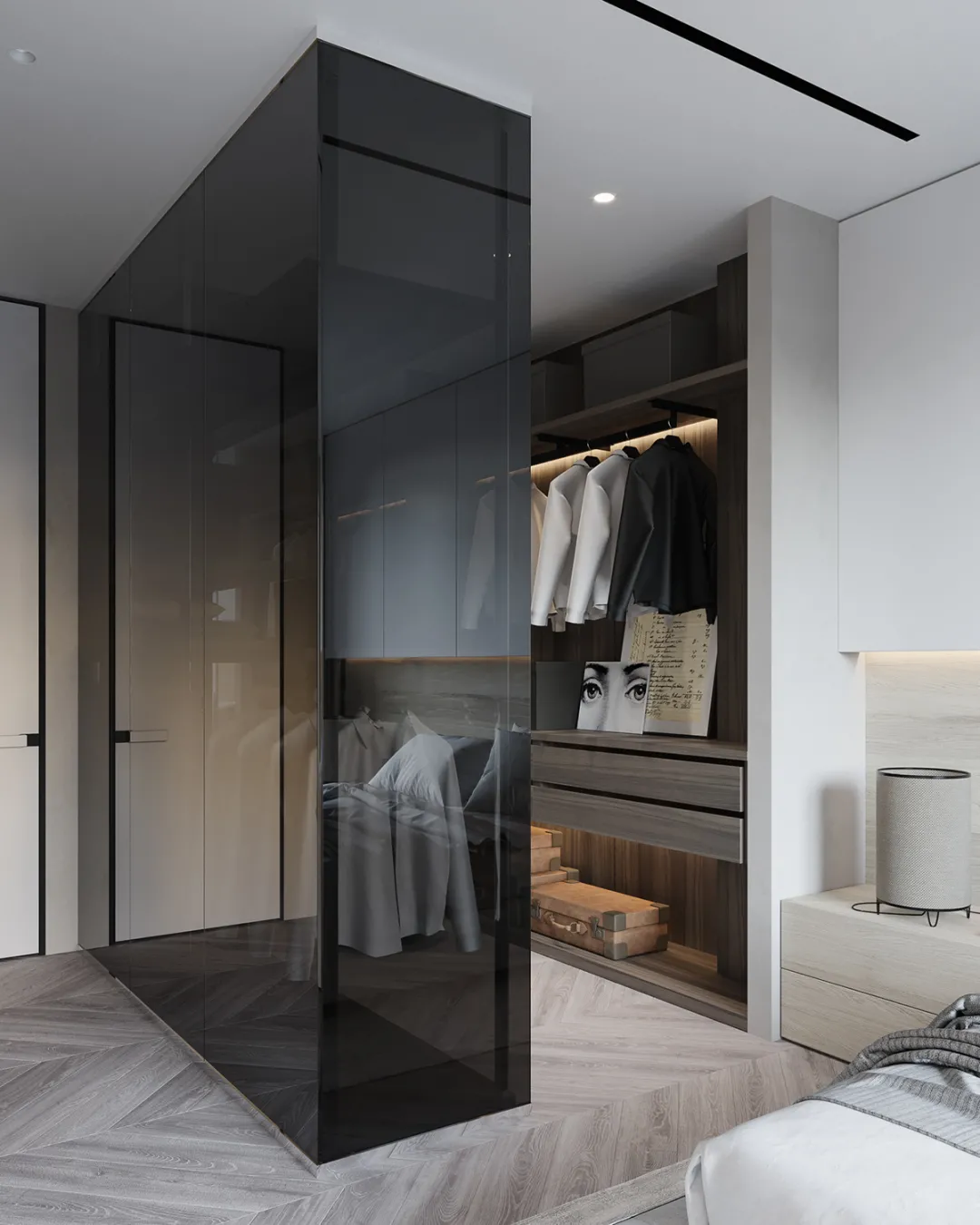
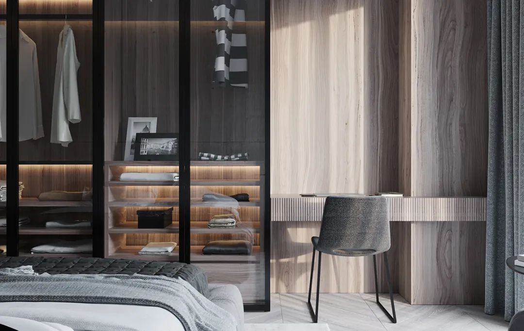
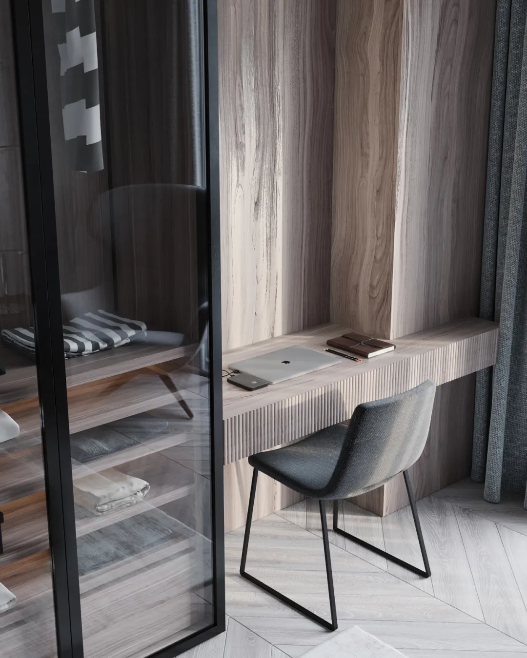
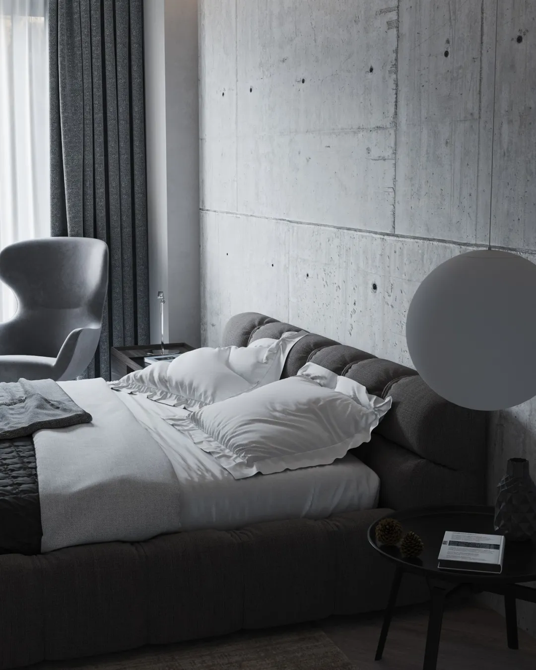
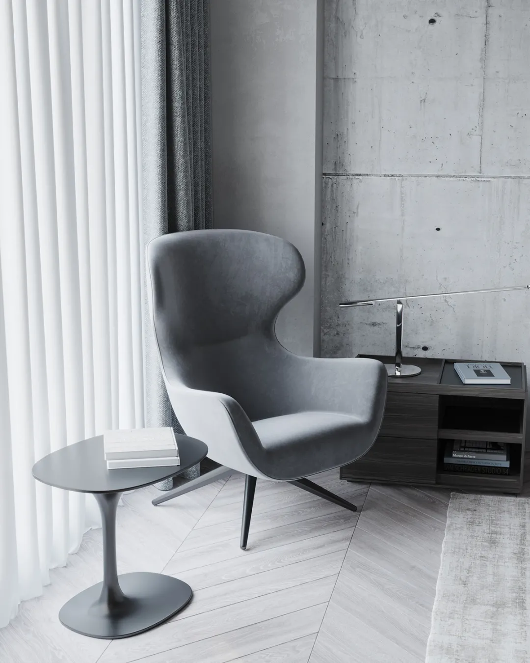
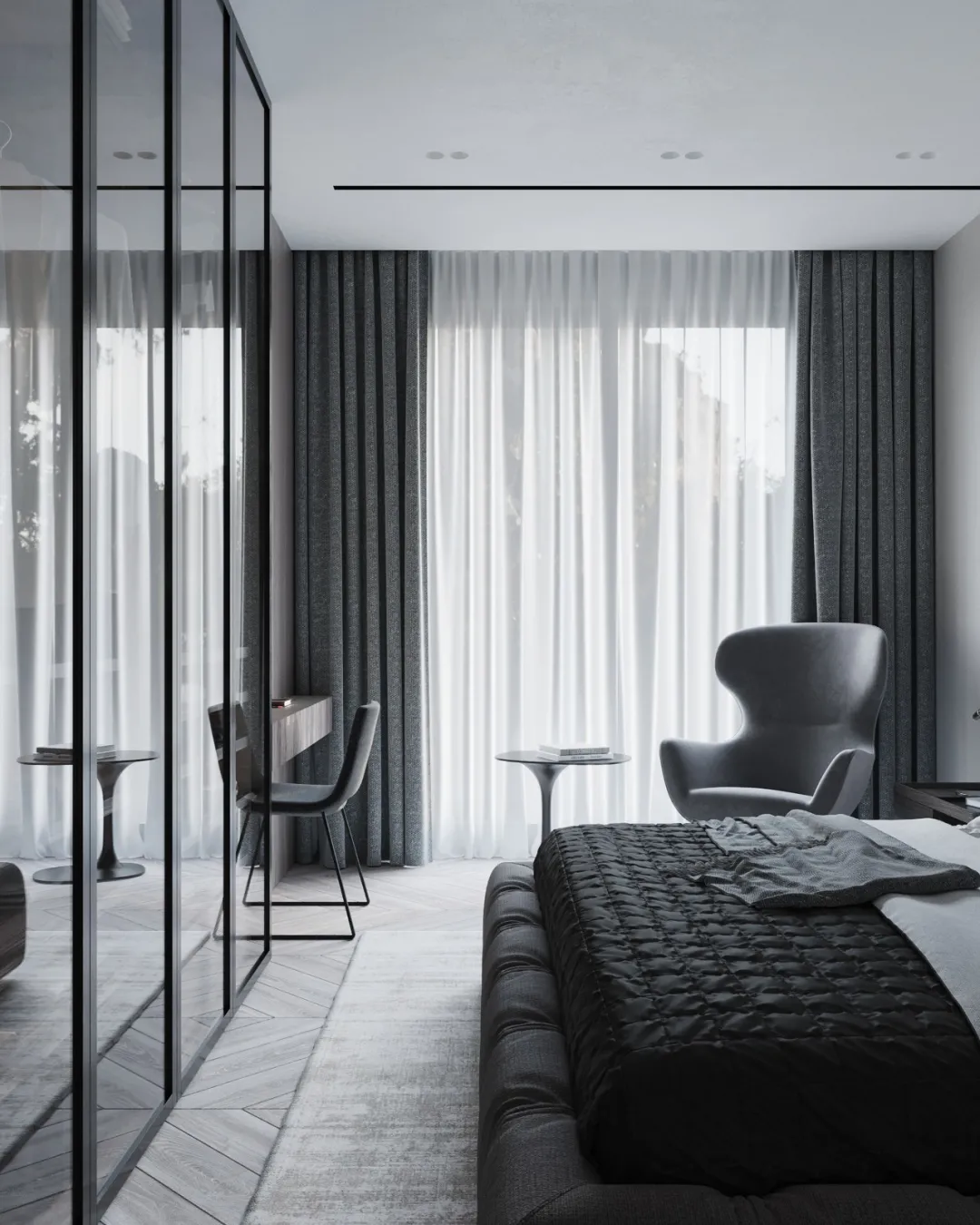
对比主卧,客卧的设计显得低调许多,半透明的衣橱有些有趣,灰色的床品,固有的灰墙,让空间感拉伸到极致。
Compared with the master bedroom, the design of the guest bedroom is a lot of low-key, the translucent wardrobe is some interesting, the gray bed products and the inherent gray wall make the space sense stretch to the extreme.
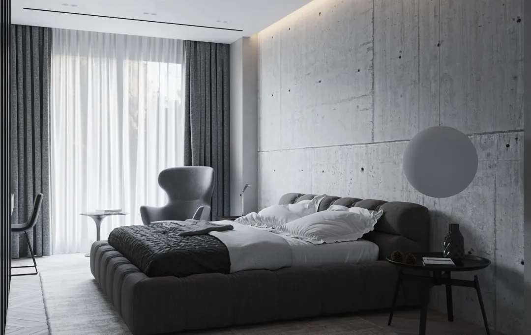
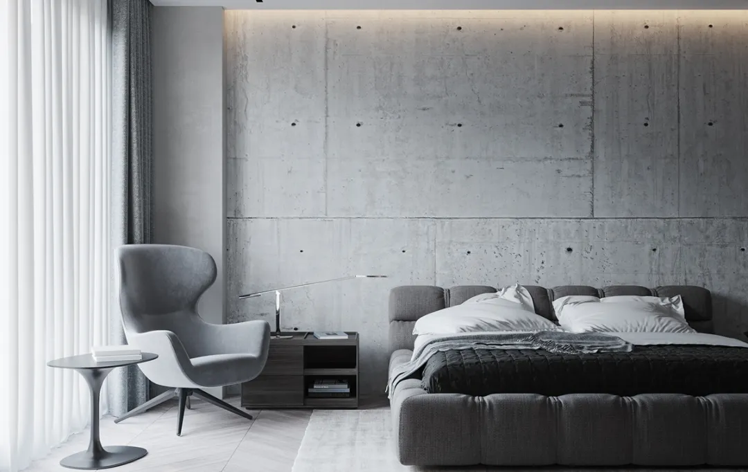
卫生间里的设计显得亮堂许多,红棕色和灰色大理石相互结合,空间感十足,整个氛围显得丝毫不单调。
The design in the toilet appears bright many, the reddish brown and the gray marble each other unifies, the spatial feeling is full, the entire atmosphere appears not monotonous at all.
